BDS Token System
Barracuda Networks is a cybersecurity company founded in 2003. Over the years, many products were created and acquired without converging them or architecting them meaningfully within the portfolio. I was hired by Barracuda to help break down silos, facilitate collaboration, and design/research solutions that would meaningfully converge products together. Unifying the styles and design language across products is one of the main three projects I led to bring the products and teams together.
Barracuda Design System (BDS) was a React Material UI component library when I joined. Some products across the Barracuda portfolio were using the design system, but still experiencing major drift and inconsistency.
Problem
Products using BDS still look inconsistent because engineers write style overrides. How might we improve consistency across products that are using the design system?
My role
I was the design owner of the design system and token system.
Results
Milestones
Milestone 1
When I started to think about the token system, I had already re-built all the Figma components using a consistent application of styles. With those components and new styles, I created designs for the converged email product. Additionally, a new backup converged product was created using that system and styles.
I felt they were stable and ready to codify into a design language.
Token architecture
Based on a lot of research on other token systems, we decided to follow the three layer model.
I liked the alias layer because:
It allowed for independent compositions
It provided a space to describe the use of the style, especially color.
It gave us a way to change styles in a consistent way
Token Structure - Color
After deciding on the overall architecture of the token system, we needed to decide on the nomenclature structure. Needless to say, this took a lot of brainstorming, especially when it came to color.
I knew I wanted to create a distinction between interactive and static elements because I wanted users to be able to intuitively know what to click because the interactive elements looked different from static elements.
I also knew I wanted to have three different levels of hierarchy so that designers can direct attention.
The final token structure
Milestone 2
… and now… the JSON…
I am so not a developer 🙈
I took a class in HTML and CSS in college but my coding ability is about where my Spanish is - I can order a beer and find the bathroom.
But I had to figure out how to write JSON, how to use git to push my code to GitHub, and how to use Visual Studio.
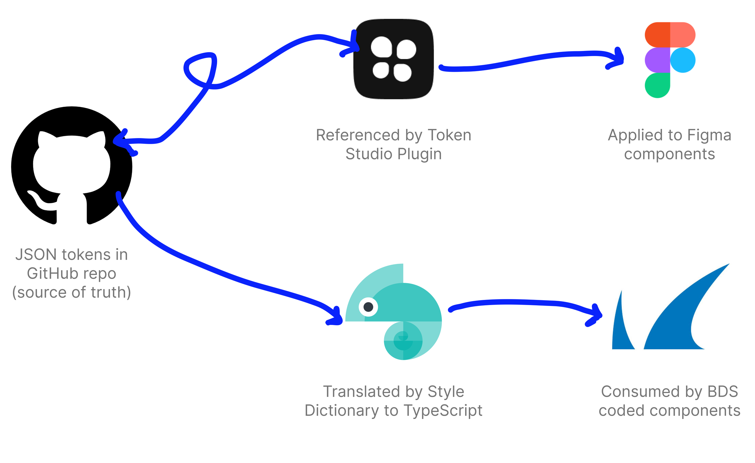
…and I did… and they built… and Style Dictionary translated the JSON to TypeScript and the BDS Tech Lead used them on coded components.
I wrote not only the token definitions for globals and components, but also the alias tokens for two themes. The two themes would allow designers to switch their designs between the theme in use and a future theme we wanted to transition to.
Milestone 3
Now that we had the token definitions and JSON written for both themes I needed to apply it to the components. This allowed us to move from having two separate Figma libraries to one single library.
Token Studio Plugin
Token Studio Plugin was not intuitive for me, but I paid the $250 to get a session with them to learn how to get our particular JSON working in it.
Figma Variables came out around the time I was finishing this step so I needed to double back and make sure variables were syncing and applying to components appropriately.
Since I wrote definitions for two themes, we could use one Figma library and switch between the theme currently in production and our future theme.
Two themes
We had a theme that was currently in use that had little styling, then we had improved styles. Both themes were possible to see with a single design through using the Token Studio Plugin.
Conclusion
I absolutely loved this journey and learned so much along the way. Here and there I will still find bugs that I need to fix, but overall the team is excited to use the new library.
I would be remiss if I didn’t mention the hardest part of this process which was educating and on-boarding the team to the token system, new library, and new design language.
It is an on-going process of education through video tutorials, written documentation, and 1:1 education sessions.